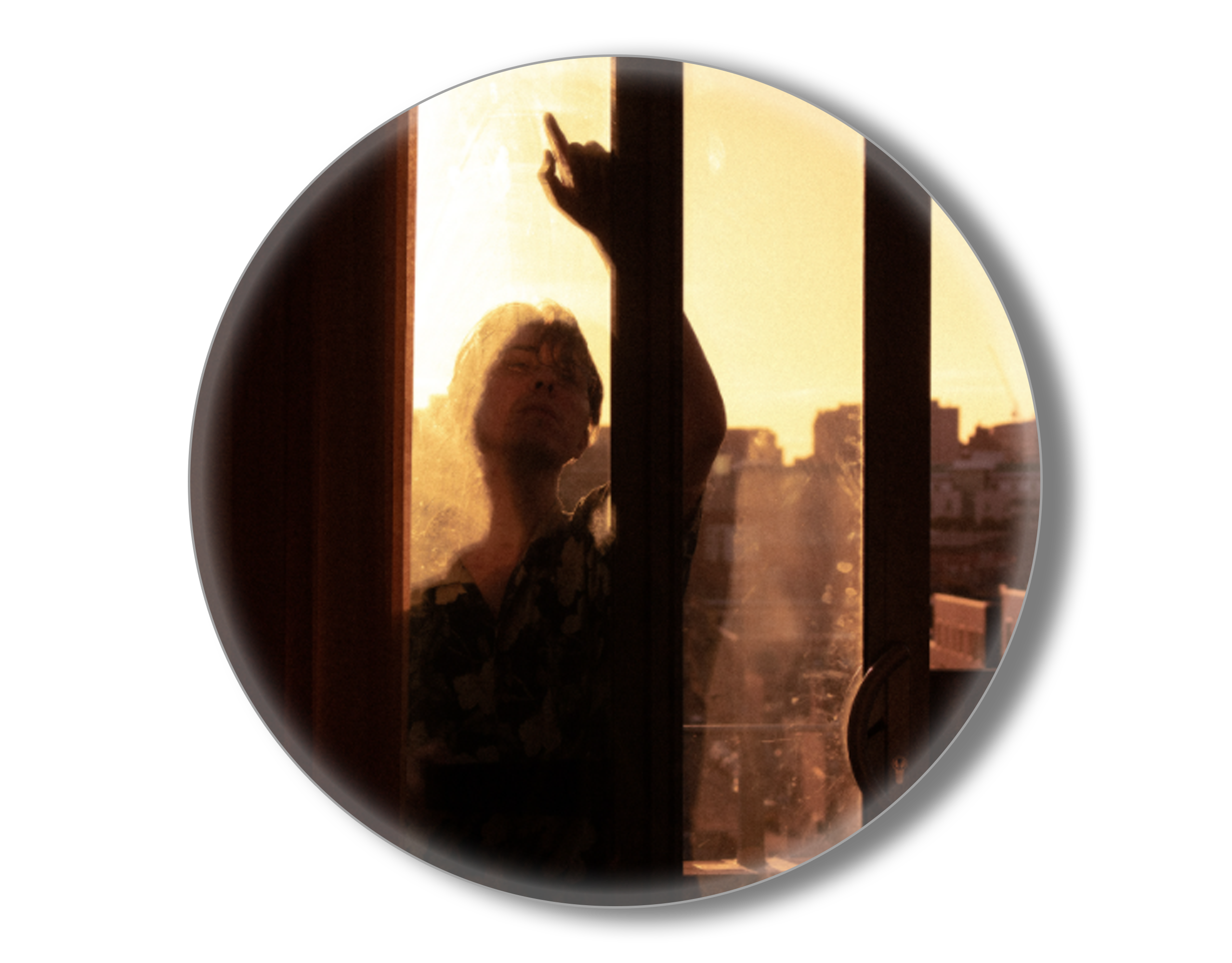
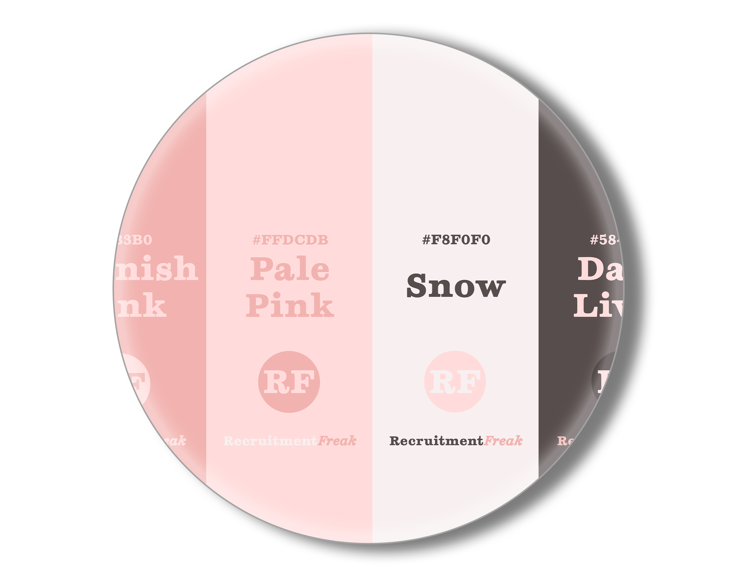
This project was an entire brand redesign, centering around an industry new format for recruitment websites.
Simplicity and personability were key to this brief, transforming a specialist recruitment agency with 33 years in industry into a brand new voice that speaks directly to its - generally younger - audience base.
We decluttered the norm for recruitment, removing anything that could be considered padding content or serve as even the smallest of obstacles for potential candidates, whilst maintaining the professional nature that industry clients have come to respect from the brand.
We designed a dynamic landing page with three key buttons that direct the audience to the exact place that they need to be, without any issues.
The 'candidate' button takes the audience to the scrolling vacancies tab, 'You', which outlines the latest vacancies and a big fat search bar for optimised perusing, helping the potential candidate to feel like we are genuinely centered around them, which we are.
The 'client' button takes the audience to the 'Us' tab, where everything is about selling who 88people are and why they're the best positioned to undertake your candidate search for you.
Having a 'help, I can't decide' button makes sure that the simplicity of the landing page isn't overkill. We want this to be accessible to everyone, and we must avoid bounces based on design alone.
This homepage 'wobbles' as you hover over each of the two buttons, using '.3js' framework to make this work dynamically. This is part of the soft brand image that we're putting across, with lots of curves throughout - humans and human experience never operate in straight lines, they're unique.
🡫 You can read a copy of the first proposal embedded below (client name redacted) 🡫

